Your Drive, at a glance
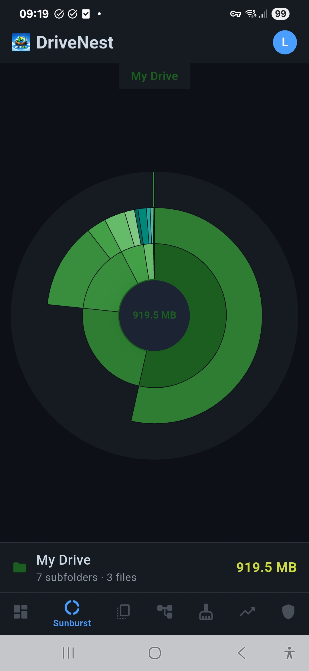
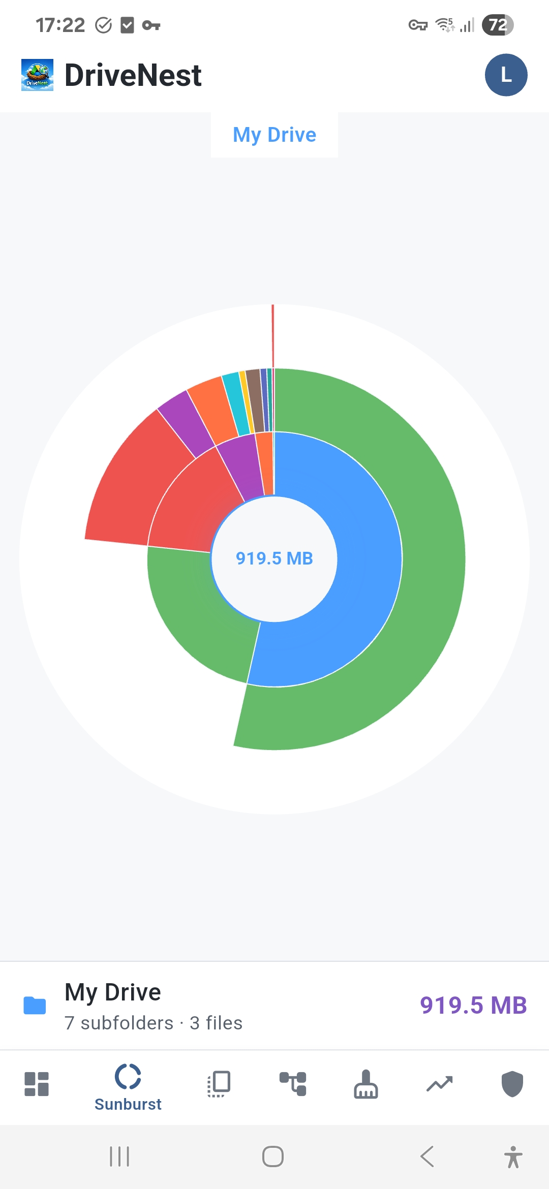
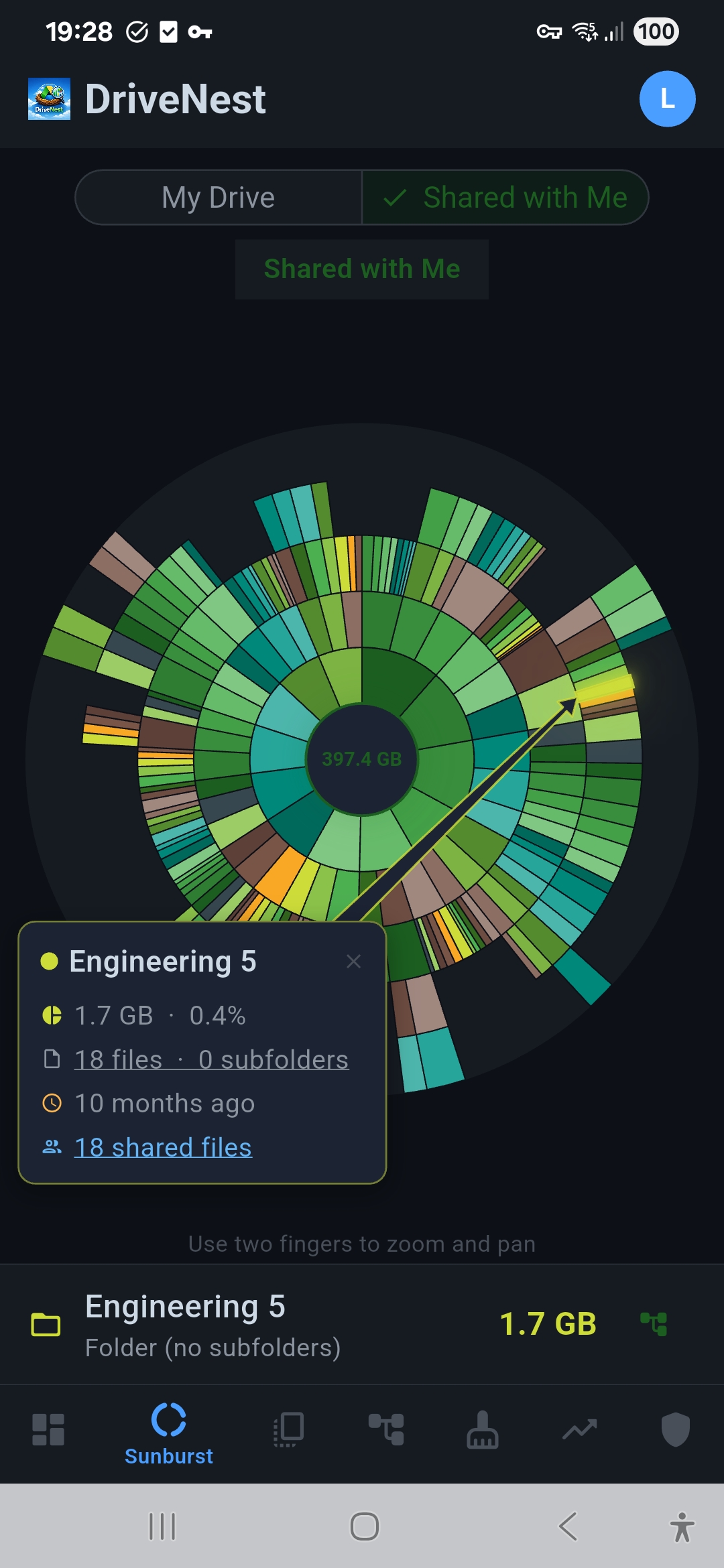
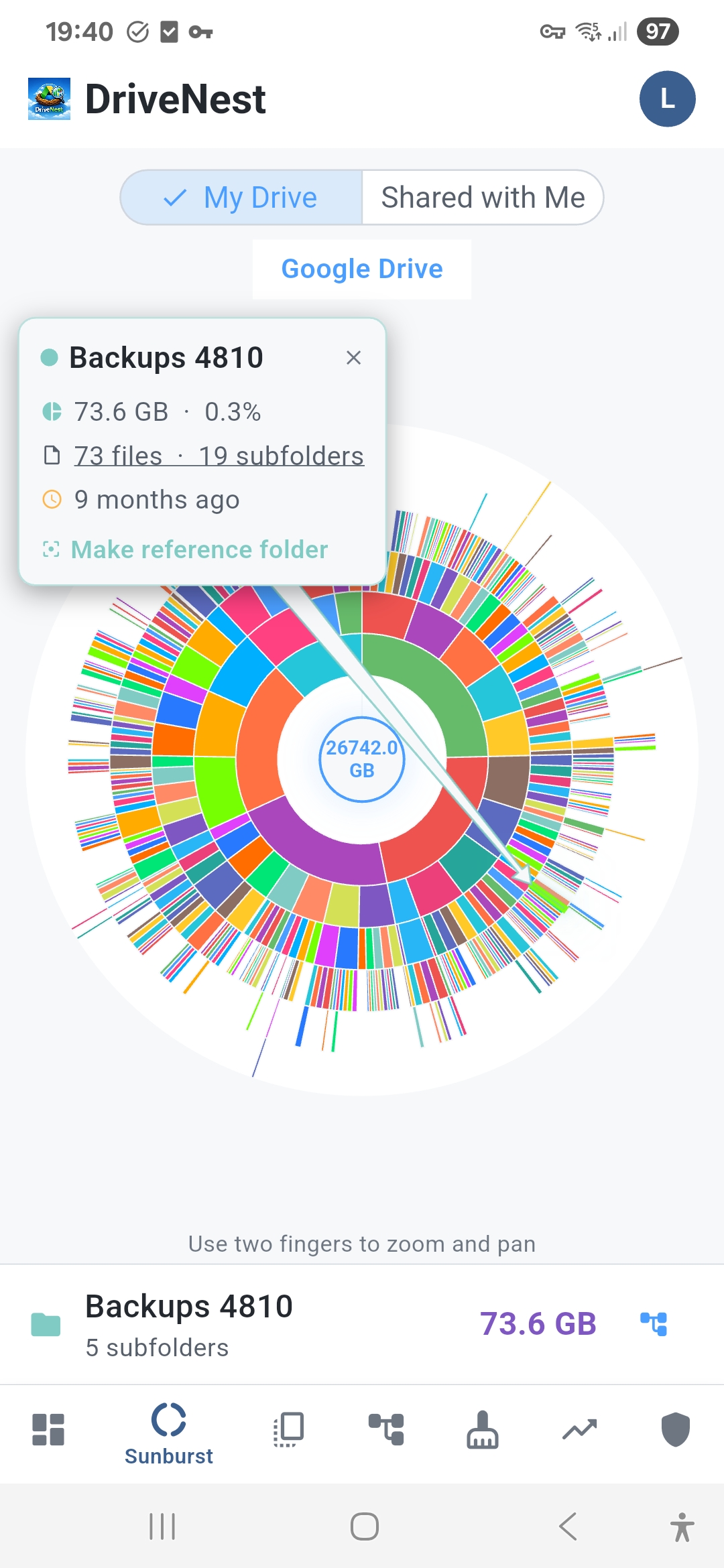
A folder list tells you what is big. A sunburst chart shows you how big, relative to everything else. Each ring represents a level of depth in your folder hierarchy, and the arc width shows exactly how much space each folder occupies. In seconds you can see that one project folder accounts for half your storage, or that a deeply nested backup folder is silently consuming gigabytes.
Tap to zoom, tap to explore
Tap any segment to zoom into that folder. The chart redraws around your selection, revealing the internal structure of that branch. A callout shows the folder name, size, and percentage of total storage. Tap the center to zoom back out. It is the fastest way to navigate a complex folder tree.
Why a sunburst chart works
- Proportional sizing — arc width maps directly to folder size, no guessing
- Color-coded depth — deeper folders get progressively cooler colors
- Interactive zoom — tap any segment to drill in, tap center to zoom out
- Detail callout — folder name, size, file count, and percentage on tap
- Full hierarchy — every folder in your Drive represented in one view
Instant clarity for complex Drives
Whether you have dozens of folders or thousands, the sunburst chart compresses your entire hierarchy into a single screen. No scrolling through nested trees, no expanding nodes one by one. The shape itself tells the story: balanced drives look uniform, lopsided drives show obvious bulges where space is concentrated.